Chop Zone indicator is a technical tool that was created by E.W Dreiss, an Australian commodities trader. He also created the choppiness index indicator, which is a relatively common one among stocks, forex, and commodities.
In this article, we will look at what the Chop Zone indicator is and how you can use it to make decisions in the market.
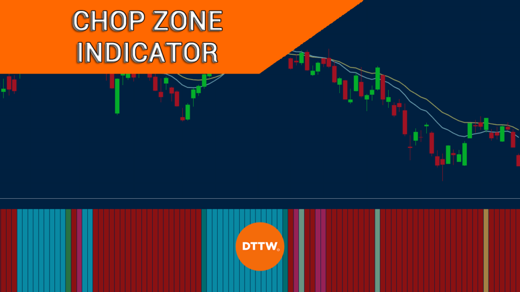
What is the Chop Zone Indicator?
Chop Zone is a relatively unpopular technical indicator that is mostly used to identify price movements in the market. It uses a series of colors to determine whether an asset is trending or whether it is in a tight range.
The default colors in the Chop Zone indicator are red, turquoise, and green although one can easily tweak them based on their trading preference.
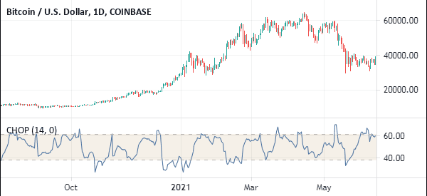
Chop Zone indicator is based on the Choppiness Index (CHOP), which is a technical tool that tracks market action using Fibonacci retracement. The chart below shows Apple shares on the four-hour chart.
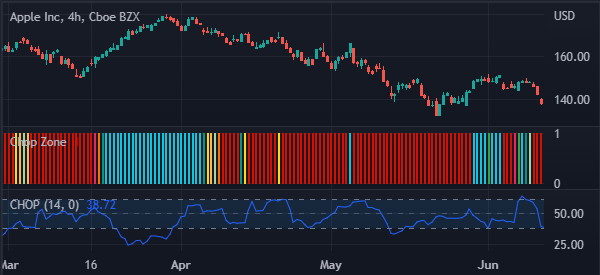
The Choppiness Index is at the lower side. And as you can see, it has a close resemblance to the Relative Strength Index.
As shown above, the Chop Zone index is made up of several bars of different colors. The index also oscillates between zero and 1.
What colors in Chop Zone mean
A common question is what the colors in the Chop Zone indicator mean. Having a good understanding of these colors will help you determine whether to buy or sell a financial asset.
First, there is the turquoise color that happened between March 18th and April 6th. This color usually signals that the asset has moved to a bullish trend. As you can see, areas of the turquoise color emerge when the Apple shares are pointing upwards.
Second, there is the yellow color. In Chop Zone indicator, this color usually signals that the asset is choppy or is in a consolidation phase.
Third, there is the red color, which signals that the stock or any other asset is in a deep sell-off. A more deeper red color usually signals that the sell-off is more intense.
These three are the most important colors in the Chop Zone indicator. But as you can see, there are usually more shades of color in the indicator. A more dense turquoise color signals that the asset is in a strong bullish trend while more intense red means that the asset is in a strong bearish trend.
How to use the Chop Zone indicator
The Chop Zone indicator is not commonly used by day traders. For one, it is a lagging indicator that uses historical data to determine whether the asset is in a range or trending market. As such, it does not show bullish or bearish signals, unlike other oscillators and trend indicators.
Therefore, it is recommended that you use the Chop Zone indicator in combination with other indicators like the Relative Strength Index and the MACD.
Chop zone step-by-step
The first step in using the indicator is to ensure that you have identified the correct chart timeframe. The indicator works on all timeframes, ranging from 1-minute to monthly charts.
Related » A guide to multi time frame analysis
Second, search for it in the indicator box. For TradingView, you will see the indicator easily when you search it. On the other hand, since it is not installed by default in MT5, you will need to manually download and install it in the tool.
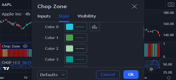
Third, you can decide to stick with the default colors or select new ones based on your preference as shown below.
Finally, we recommend that you use the Chop Zone indicator for reference. You should then combine it with other trading strategies like price action and indicator analysis.
In price action, you should identify chart patterns like triangle, rectangle, head and shoulders, and cup and handle to make decisions. You should also use candlestick patterns like hammer, bullish engulfing, and morning star.
A good example of how to use the Chop Zone is shown in the chart below.
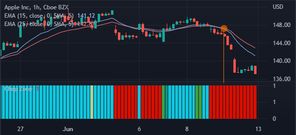
As you can see, the 15-period and 25-period moving averages made a bearish crossover as the Chop Zone turned red. This is a sign that the bearish trend is still intact.
Chop Zone vs Choppiness Index
The Chop Zone and Choppiness index were created by a single individual but they are distinctly different. As shown above, the Choppiness index is an oscillator that is used to identify overbought and oversold levels.
Its original aim is to identify whether an asset is highly volatile or not. However, because of how it looks, many traders use it to identify overbought and oversold points as shown below.
The Chop Zone indicator, on the other hand, is visually different since it is made up of differently colored bars. Also, the only settings that you can tweak in the Chop Zone indicator are the colors. In Choppiness Index, you can change the reference period and the overbought and oversold periods.
Cons of using the Chop Zone indicator
There are several cons of the Chop Zone indicator. First, it is unclear how it is calculated. Second, it is not ideal to use in very short-term charts like a 1-minute or 5-minutes. Finally, the indicator does not have good buy and sell signal levels.
Final thoughts
In this article, we have looked at what the Chop Zone indicator is and how to use it in the market. We have also compared it with the Chopiness Index and noted some of the cons of using the tool.
External useful resources
- What is Chop Zone? How is it useful while trading stocks? – Quora
