As a day trader, your success is determined by a number of things. Some of these factors that determine your level of success include:
- your knowledge of the financial and economic markets
- your patience
- understanding of the various analysis tools
- your character as a trader
Unless you have a good understanding of all these, chances are that you will end up losing your money.
Among the several strategies for analyzing an asset, one of the most effective is undoubtedly the multi time analysis.
What is a multi time analysis
Multi-timeframe analysis is the process of combining different periods in the financial market before you make a trading decision. It is one of the most important aspects that all day traders and swing traders use.
The idea is relatively simple. Before you initiate a trade, you take time to look at how the charts look in most timelines.
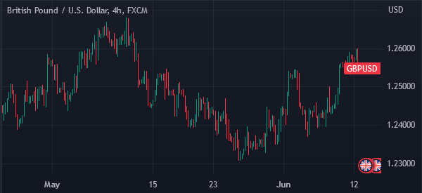
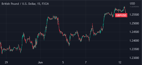
Most day traders start by looking at the overall long-term chart like a daily one. They then look at the four-hour chart, down to hourly, and the 5-minute chart.
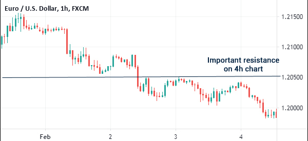
Doing this can help you in several ways. First, it can help you identify the overall flow of an asset. Second, it can help you identify key levels of support and resistance, as shown in the chart below.
For example, in the chart below, the level shown in red may not look important on the hourly chart. However, it is an important resistance on the four-hour chart.
Third, multi-timeframe analysis can help you identify areas of putting stop-loss and take-profit. And finally, this type of analysis can help you identify key chart patterns.
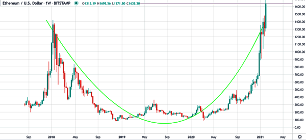
For example, in the weekly chart below, we see that the ETH/USD was forming a cup and handle pattern. This is usually a bullish pattern that leads to a continuation.
However, when you look at the hourly or four-hour chart, this pattern will not be easy to identify.
The need to check multiple time frames
Most trading systems will let you shift between 1 minute charts to yearly charts. The challenge for any trader is to find the best time frame to use based on his strategy. We had this challenge as well.
This is because in an hourly chart, the chart’s moving average might be heading higher but in a daily chart, the moving average is moving up. In addition, the average directional index might be at 34 in the daily chart but be 19 in the one hour chart.
In fact, all technical indicators will show different results when used in certain times.
The purpose of multi-timeframe analysis
Multi-timeframe analysis is a very important thing that all traders and investors should always consider. There are several reasons why this analysis is important.
First, it is the best approach to confirm a trend in the market. In some cases, you can see that an asset is consolidating in the five-minute chart. But when you look at it in the daily chart, you realize that it is in a strong bullish trend.
Second, you should do a multi-timeframe analysis to confirm a chart or candlestick pattern. For example, if a chart forms the doji pattern on the 5-minute chart, a multi-time analysis will help you confirm the trend.
Third, it provides a broader perspective of the state of the market. And finally, this analysis helps you to identify the potential support and resistance levels.
How to Identify the best timeframe
A common challenge among day traders is about how to identify the right timeframe. In fact, many people have given-up on their dreams of being traders because of lack of knowledge about this.
There are some things to consider when selecting the best timeframe. First, consider the volatility in the market. For example, if you see an asset being in a range in a daily chart, narrowing it to the hourly or 30-minute chart will show you how volatile it is.
Second, look at the trend visibility in the market. Finally, the most important part will be the type of trader that you are. Because of its importance, this section will be much longer than the first two.
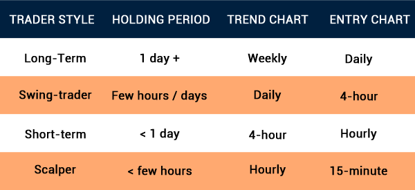
Are you a swing trader, day trader, or long-term trader?
Swing Trader
A swing trader is a person who opens trades and holds them for a few days. Their goal is to identify patterns and then buy or short an asset for a while.
In most cases, swing traders use hourly, four-hour, or even daily charts. In most cases, using a weekly chart will not make sense.
Day Trader and Scalper
A day trader is one who opens and closes trades within a day. There are two main types of day traders.
First, there are scalpers, who are people who initiate a trade and then close it abruptly after they make a small profit. These traders use charts whose timeframe is below 10 minutes.
Therefore, their multi-timeframe analysis can be to examine 15-minute, 10-minute, 5-minute, and then 1-minute charts.
Second, there are day traders whose goal is to hold a trade for several minutes. Their biggest goal is to ensure that all trades are closed by the time they go to bed.
A multi-timeframe analysis in this case can be to look at a daily-chart, four-hour chart, and then an hourly chart.
Long-term traders
Third, there are long-term traders who focus on buying or shorting an asset and then holding the trade for days or months. For these, this analysis can be looking at monthly, weekly, daily, and then hourly charts.
To determine the charts to use, you must understand the trader that you are and then use the respective chart.
Related » Learn when to enter and exit a trading position
Multi Time Frame Analysis as a long Term Traders
Remember that it is possible to make money in any way. For long term traders, they need to use the long term chart such as weekly or monthly charts. They don’t care what happens during the intraday. All they care about is what will happen in a certain week or month.
If they are bullish about a certain asset, they understand that the path to higher levels will not be smooth. On certain days, the charts will go high while on other days, the charts will go down.
The advantage of having a long term view is that it allows one to have the bigger picture and also avoid huge transactional costs in terms of profits. For such a trader, they will focus mostly on the daily, weekly, and monthly charts.
In addition, since long-term traders look at the bigger picture, they are less worried about what the next economic data will be. They have factored this in their bull or bear case.
Multi Time Frame Analysis as a Swing Traders
The other category is on swing traders. These are people who have a medium term view of the market. They care about the asset classes that they own.
For a swing trader, the monthly chart will be irrelevant. This is because they don’t care about the long-term view of the asset, they are only interested in knowing how a trade will move within a day or two.
Therefore, these traders use the hourly and daily charts. By doing this kind of analysis, they will have a clear picture of what will happen.
Multi Time Frame Analysis as a Day Trader
Finally, there are intraday traders who open trades and close them within minutes. The benefit of being an intraday trader is that it reduces the costs (swaps) of overnight trading. It also allows one to make money when the price dips and when it moves up.
For these traders, the hourly and minutes charts are relevant. It’s of no use to understand how the market will behave in the next week or month.
Multi Time analysis step-by-step
Choose a timeframe
The first step of using the multi-timeframe analysis is to identify the times to use. We recommend three times when trading.
This will depend on your trading strategy and style. If you are a scalper, you can use the 10-minute, 5-minute, and 3-minute charts.
Similarly, if you are a swing trader, you can select the four-hour, hourly, and 30-minute chart. As you do this, you should identify support and resistance levels and note the technical indicators.
Confirm signals
In the next step, identify the potential entry and exit signals in each timeframe. These signals can be because of technical indicators like moving averages and Bollinger Bands.
Also, they can be in the form of chart patterns like triangles, head and shoulders, and wedges. They can also be in the form of candlestick patterns like doji and hammer. You should write these signals down in a piece of paper or your trading journal.
Pinpoint entry and exit levels
Finally, pinpoint the potential entry and exit levels in the chart. Many chart platforms like TradingView and MT4 have tools that can help you do annotations. You should set the entry and exit points that take note of the three time frames used.
Multiple Timeframe: indicators & Analysis
Technical Analysis as A Day Trader
As a day trader, you will most likely use short term charts. Therefore, you will need to be perfect at conducting technical analysis to determine the support and resistance levels.
In addition, you need to configure the technical indicators to match the specified period of time you will be trading. Most technical indicators have the default levels based on a 14 day period. As a day trader, you want the indicators adjusted to hours or minutes.
As We explained in a previous article, you should stick to a maximum of 3/4 indicators at a go. Having very many indicators will crowd your trading space.
Fundamental Analysis
Fundamental analysis is very important when trading with multiple timeframes indicators. In our previous articles, We have specifically warned day traders against trading during the data timeframe.
In this, We would not advise you to trade 30 minutes before or past the release of significant data such as the employment numbers. Trading at this time will subject you to volatility which can always wipe away your profits
Related » How to trade in periods of high volatility
Therefore, the first thing you ought to do every morning before you start trading is to look at the economic calendar and have a look at the economic data for the day.
Then, you should set a timer or reminder to help you avoid being caught up in volatility.
Multiple Time frame indicators at work
After understanding how to perform technical and fundamental analysis as a day trader, We will now explain the best way to carry out a multiple timeframe analysis. To do this, we will use a strategy known as the ‘rule of three’.
First, We always go for the 4-hour chart. This chart is ideal because it gives the general picture of the day. If the chart is on an upward trajectory, then the logical thing to do is to place a BUY trade.
However, as a day trader, our goal is not to perform an analysis for the 4-hour chart. We intend to use the 15-minute chart. Therefore, we then zoom in the 1 hour chart and perform some preliminary analysis.
Finally, after understanding the medium-term trend, We try to search for the best opportunity in the 15-minute or the 1-minute chart.
As a day trader, We recommend that you start by understanding yourself. You need to be someone who is able to make fast analysis!
By taking time to understand yourself, you will be in a better position to set a good trading strategy, because your success will be anchored by the type of strategy that you use.
In addition, We recommend that you first take time to analyze the charts from a wider timeframe. This could be a yearly or monthly chart. This will give you an opportunity to understand how the technical and fundamental issues move the chart.
Benefits of multi-time analysis
There are many benefits of using multi-time analysis. Most of these benefits have already been covered above. Repeating it doesn’t hurt anyway, so let’s emphasize the essentials again.
Better trend confirmation
Trends are the most important parts of day trading. Anyone who is able to find trends early can succeed in day trading and investing.
By looking at at least three timeframes, you will be in a good position to confirm whether the trend is indeed forming.
Improved entry and exit points
The next important benefit of multi-time analysis is identifying entry and exit points. Alternatively, it is a good approach to find support and resistance levels of a trade. A support is said to be a floor where an asset fails to move below while a resistance is a ceiling. Looking at numerous timeframes will help you see the best levels.
Also, multi-time analysis helps to put into perspective tools like the Fibonacci Retracement level and Andrews Pitchfork. For example, a Fibonacci retracement applied in the daily chart will be different from one implemented in the four-hour chart.
Reduced false signals
The other benefit of using multi-timeframe analysis is that it reduces false signals in the market. A good example of this is when you identify a doji pattern on the 5-minute chart.
To confirm that a reversal is about to happen, looking at the 15-minute and 10-minute charts will help you to reduce these false signals
Final thoughts
Multi-timeframe analysis is an important thing for all traders. In fact, many professionals in the industry use it every day.
Before you open a trade, we recommend that you look at a chart in several timelines. This will help you avoid making mistakes and identifying some points of interest.
External useful resources
- Multiple Time Frames Can Multiply Returns – Investopedia
- [VIDEO] How to Use Multiple Time Frame Analysis to Find Better Entry and Exit Points
