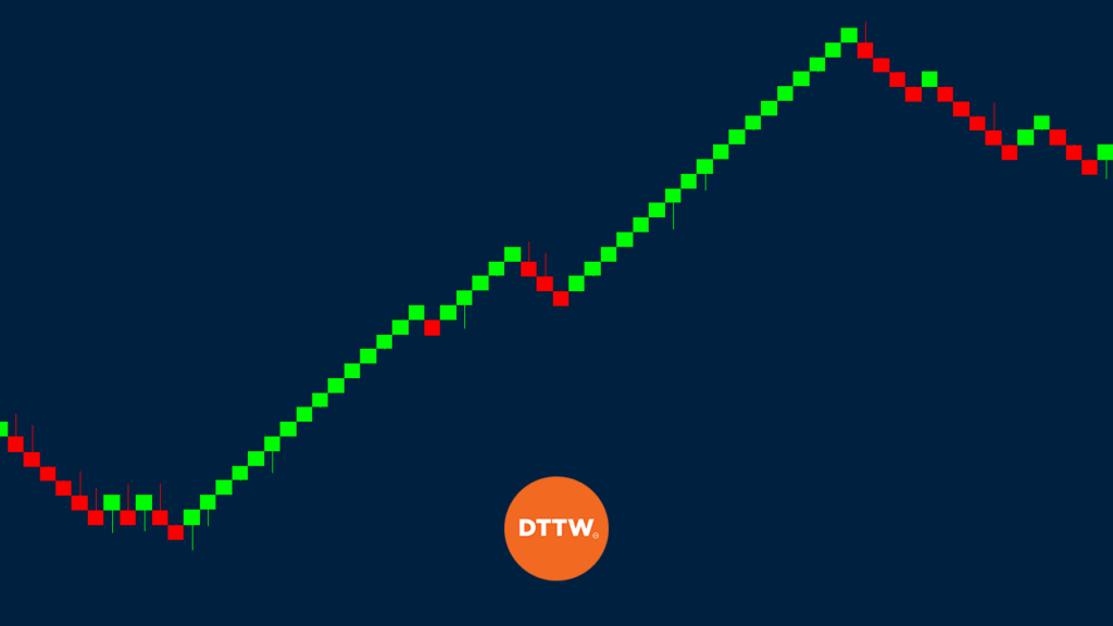
There are many types of charts in the financial market. There is a line chart that is mostly effective in showing the overall trend and bar charts that are rarely used. The most common charts is the candlestick because it shows the opening, body, and the closing price (we talked about the best candlestick patterns here). This is the chart we have used in all our previous guides.
There are other chart patterns that are most commonly used by professional traders. The best-known of these are the kagi, three-line break, renko, and point and figure. The first three were developed in Japan more than 200 years ago while the point and figure was developed by an American.
Part of the reason why they are not common is that they are not found as a default in the MetaTrader, maybe the most commonly used platform. Also, while they are found in TradingView, they have limitations in the free account.
In this report, we will focus on the Renko chart and explain how to use it in the market.
› Here, instead, you can know more about OHLC Chart
What is the Renko Chart?
The renko is a relatively complicated chart that focuses solely on the price of an asset and ignores the time factor.
Renko are usually simular to the American point and figure, with the only difference being that they have blocks and boxes instead of X and O columns. The renko charts usually move in a 45-degree lines, with one brick per vertical column.
Renko chart patterns are relatively similar to point and figure in that they remove the time factor in charting. The main difference between renko and P&F is that it replaces the X-columns and O-columns with bricks or boxes that represents a fixed price move.
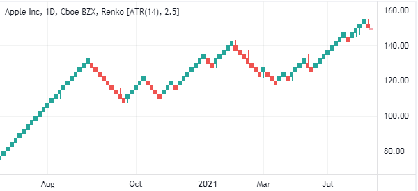
When applied in a chart, the green boxes are signs that the price is rising while the red bricks are signs that it is falling. This is shown in the chart below of Apple shares. Still, depending on your preferences, you could change these colors.
How to draw it
Traders first need to set the brick value or the range unit, with the most popular ones being 10. This means that a move of 10 points and more is required to draw another brick.
For example, if the price of a stock is trading at $100 and you want to use a 10-point chart, then the price has to move to at least $110 for the white brick to be drawn. Also, if the price moves to $115, the renko will be drawn up to $115 and the next part will not show.
On the other hand, if the price moves up or down by less than the minimum fixed point, then no brick is drawn.
How do Renko Charts Work?
Unlike other types of charts, it is not necessary to use technical indicators when using renko. Instead, the buy and sell signals are sent when the colour of the bricks change colour.
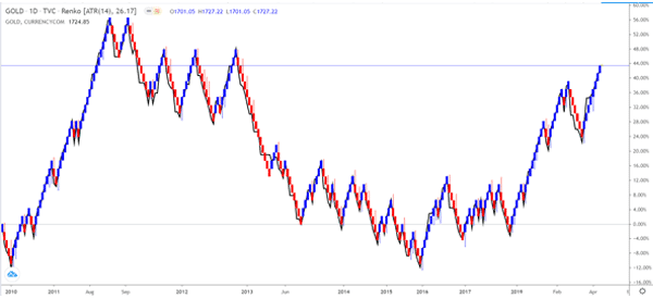
For example, in the chart below, We have added a renko chart and a line chart of gold. As you can see, the bullish trend remained so long as the renko chart was blue in colour. A bearish trend remained when the renko was red in colour.
Advantages of using the Renko in your Trading Strategies
There are six key benefits of using the renko charts instead of a candlestick chart. These are:
- Filtering the noise – The renko chart focus solely on the price of an asset. As such, it removes the time factor.
- Support and resistance identification – As you will see below, the renko chart usually makes it relatively easy to identify the support and resistance levels.
- Trend identification – while it is easy to identify a trend in candlestick patterns, the renko makes its easier to identify upwards and downward trend.
- Determining the time to offset positions – this is an important step because candlesticks don’t provide the price target.
- Provide a broader view of the market – as you will see in the example below, renko patterns usually provide a longer term view of the market.
- Essential in some specific types of markets – renko charts usually work well in markets like mutual funds that provide only closing patterns.
Renko trading strategies
We highly recommend Renko charts to advanced traders. In most cases, a candlestick pattern will do just fine to most traders.
There are several renko trading strategies. First, you can use it to identify patterns like triangles and double-bottoms. Second, you can use the renko charts to place stop-loss and take-profits. Also, you could use Renko to identify bullish and bearish trends.
Renko vs Heikin Ashi
Heikin-Ashi is another type of charts that was discovered in Japan. The term Heikin stands for average while Ashi means pace. Therefore, the chart simply means the average pace of prices. Traders use these charts to find when an asset is trending or reversing.
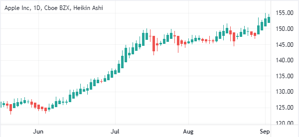
The chart below shows how a Heikin Ashi chart looks like. As you can see, it has a close resemblance to the candlestick charts.
Renko vs Candlesticks
Candlesticks are the most popular types of charts in the market. The chart is made up of four key parts, commonly known as OHLC. In other words, the candlestick tells you the open, close, high, and closing prices.
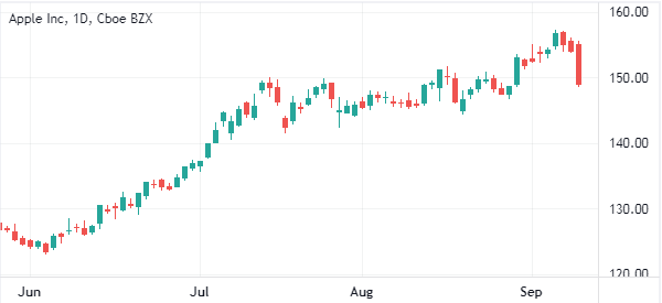
In a daily chart, a candlestick represents a single day. The chart below shows the same Apple stock using the candlestick chart.
Final thoughts
Renko chart is not well-known among new traders but it is widely used by professional traders. In this report, we have looked at what the renko is, how it is drawn, and how you can use it in the financial market. You can learn how to use it by practicing in a demo account.
External useful Resources
- Difference between using M1 and other timeframe data – RenkoTraders
- Use Renko Charts to Capture Big Forex Price Moves – TheStreet
